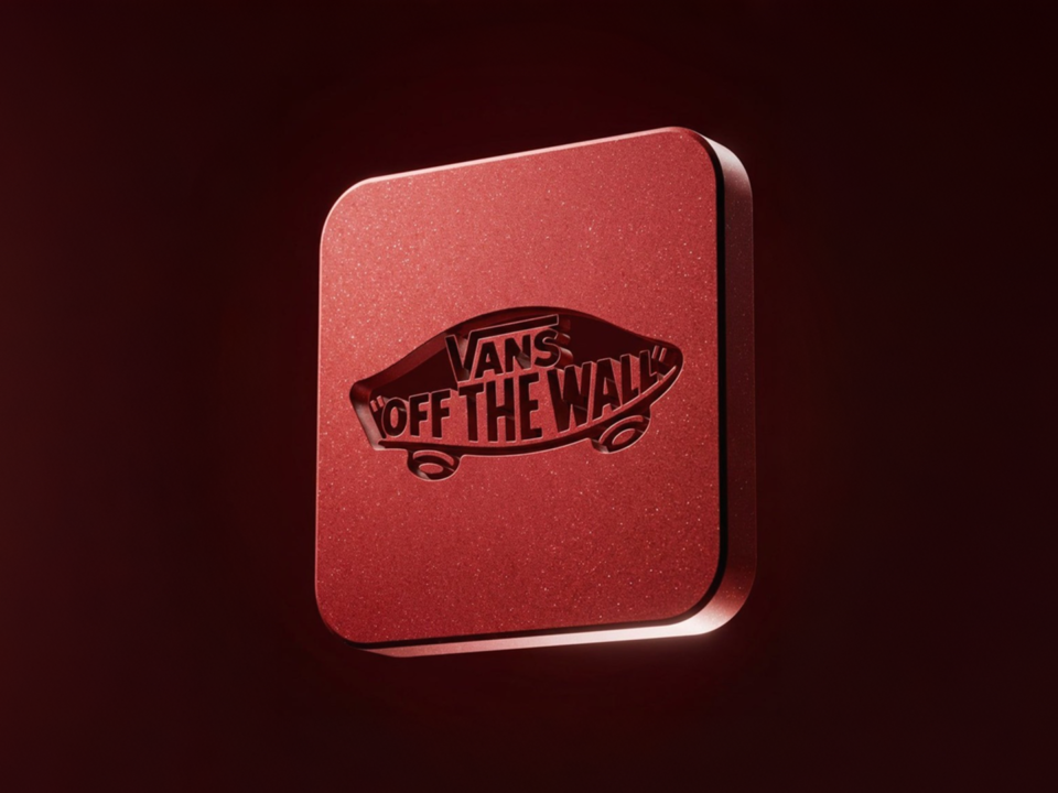
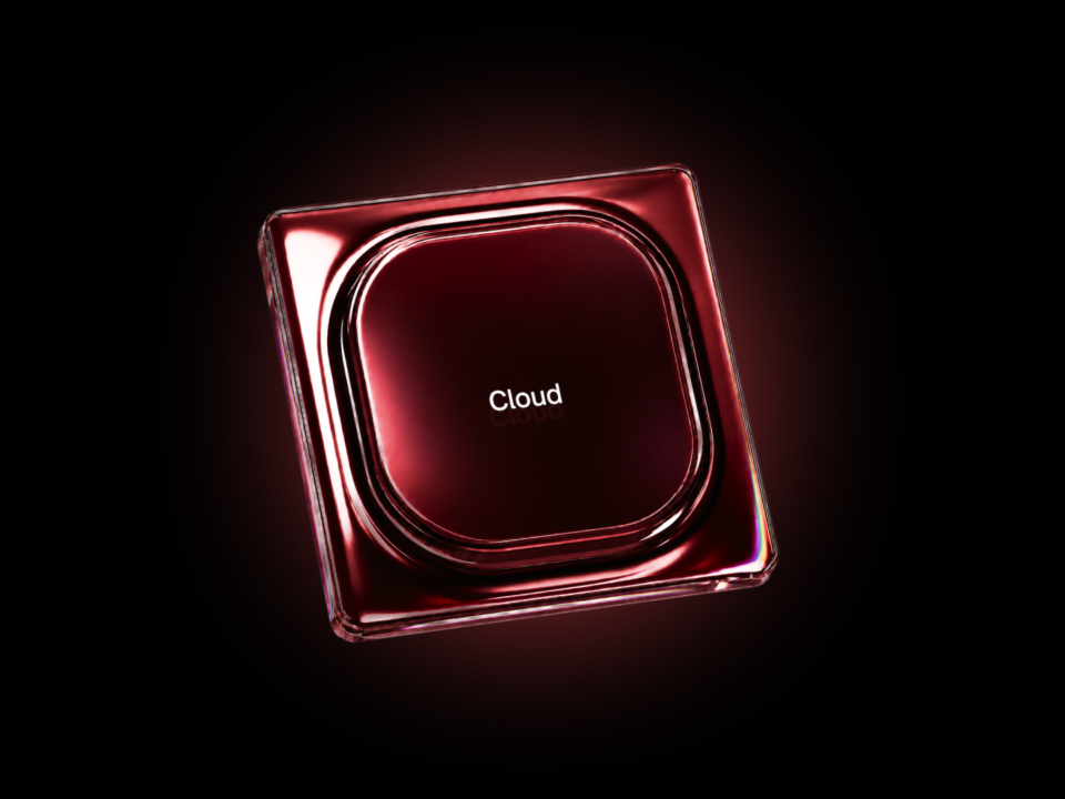
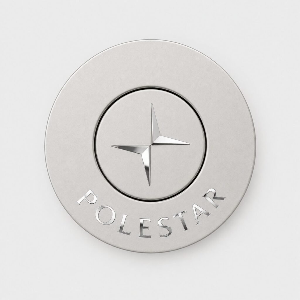
3-variable AI prompt turns any logo into a 3D luxury logo. Ideal for premium brand design assets.
How to use the prompt
Variables: [BRAND NAME], [MATERIAL], [BACKGROUND COLOR].
Replace [BRAND NAME] with the brand you want (e.g. Apple), [MATERIAL] with the material (e.g. matte black aluminum), and [BACKGROUND COLOR] with the background color (e.g. gray). Then paste the full prompt into GPT Image.
This prompt works great for websites, social media, pitch decks, packaging, or any project that needs polished modern brand visuals.
Create
 image

[BRAND NAME = ________________]
[MATERIAL = ____________________]
[BACKGROUND COLOR = _______]

Create a square 1:1 ultra-refined studio CGI visualization of a small circular luxury hardware object branded with [BRAND NAME], floating against a plain solid [BACKGROUND COLOR] background.

CORE VISUAL SYSTEM

Create a restrained two-part circular object whose visual sophistication comes from the contrast between:

— a broad, nearly flat matte body made from [MATERIAL];
— an inset central circular component in the same matte material;
— extremely clean mirror-polished silver branding;
— a microscopic dark assembly seam;
— large controlled studio reflections visible primarily inside the polished logo and lettering.

The object should feel like precision luxury hardware or a highly refined fashion accessory component.

It must NOT feel like a conventional button, medal, coin, enamel pin or generic 3D logo mockup.

The key visual hierarchy is:

MATTE OBJECT → DARK PRECISION SEAM → MIRROR-SILVER BRANDING.

BRAND ACCURACY

Automatically identify the authentic official identity of [BRAND NAME].

Use the brand's most recognizable official standalone symbol whenever one exists.

Preserve its canonical silhouette, proportions, stroke relationships, curves, intersections, counterforms, internal negative spaces and component spacing.

Do not redesign, simplify, merge or invent a substitute mark.

Place the authentic standalone symbol in the central circular insert.

Place the authentic [BRAND NAME] wordmark separately along the lower arc of the outer circular body, following the curvature of the object.

Preserve the recognizable typography, letter proportions and spacing character of the official wordmark as closely as possible.

Do not introduce slogans, invented typography or secondary text.

FORM AND CONSTRUCTION

Construct the object as a precisely manufactured shallow circular assembly.

The entire form must be significantly flatter and more architectural than a conventional button.

Do NOT create a strongly domed, inflated or pebble-like silhouette.

OUTER BODY

Use a broad annular outer plate with a predominantly flat front face.

Approximately 80–90% of the visible front surface should read as nearly planar.

Only near the extreme outer perimeter should the surface transition into a restrained edge radius.

The edge transition should occupy approximately the outermost 4–7% of the radius.

Keep the curvature subtle and mechanically controlled.

The outer profile should feel CNC-machined, precision-cast or finely molded rather than soft, inflated or cushion-like.

Use a very shallow overall thickness, approximately 4–7% of the total object diameter.

From the direct top-down camera position, almost no sidewall should be visible.

OUTER EDGE

Use a restrained micro-radius rather than a large rounded rollover.

The outer edge should feel crisp but physically manufacturable.

No pill-shaped cross section.
No large convex dome.
No thick rounded lip.
No bulbous perimeter.

CENTRAL INSERT

Create a separate circular central insert occupying approximately 48–56% of the total diameter.

Its front face should also be predominantly flat.

It may have an extremely subtle shallow convexity only to catch broad studio gradients, but the curvature must remain almost imperceptible.

The center insert must not resemble a raised push-button.

Keep it visually flush or only microscopically offset relative to the outer body.

ASSEMBLY SEAM

Separate the center insert from the outer body using one extremely narrow continuous annular gap.

Gap width approximately 0.5–1% of total object diameter.

The gap should contain a thin naturally dark shadow caused by physical recess depth and ambient occlusion.

It must look like a real precision assembly tolerance.

Do not create a thick black ring.
Do not add a decorative outline.
Do not exaggerate the recess.

MATERIAL SYSTEM

Fabricate the outer body and central insert from [MATERIAL].

The base object must have a controlled matte / satin finish.

For satin-coated metal, use approximately:

surface roughness 0.28–0.38;
very fine low-amplitude microstructure;
soft diffuse reflection response;
broad low-contrast specular gradients.

The surface should feel dense, cool, precisely manufactured and extremely clean.

Avoid coarse grain, powder-coat texture, orange peel, visible procedural noise or porous roughness.

At normal viewing distance the matte front surfaces should appear essentially smooth.

Any microscopic material structure should only break perfectly uniform reflections at extreme close inspection.

Keep the outer body and central insert within exactly the same material family.

Do not introduce unnecessary material changes between them.

BRANDING MATERIAL — CRITICAL

The central brand symbol and curved [BRAND NAME] lettering must use a completely different optical finish from the matte body.

Render all branding as highly polished silver metal.

Use a mirror-polished chrome / polished silver appearance with extremely low roughness, approximately 0.015–0.045.

The branding should be:

— smooth;
— reflective;
— optically clean;
— metallic;
— high-contrast against the matte body;
— free from visible texture.

The silver should not appear as flat gray printing.

It must react strongly to the surrounding lighting environment through real specular reflection.

The polished logo and lettering are the primary visual luxury accent of the entire object.

BRANDING CONSTRUCTION

Keep the branding physically restrained.

The logo and letters may be:

— extremely shallow polished-metal inlays;
— flush bonded metallic inserts;
— precision polished metallized surfaces;
— or extremely shallow relief approximately 0.2–0.5 mm above the matte substrate.

The effect must remain almost flush.

Do not turn the branding into chunky raised lettering.

Do not create deep engraving.

The physical depth should be barely perceptible from the top-down camera.

REFLECTION SYSTEM — CRITICAL

Use the mirror-silver branding as the primary carrier of environmental reflections.

Create a controlled invisible studio environment around the object specifically so the logo and letters reflect elegant abstract light shapes.

Use:

1. one enormous white rectangular softbox positioned above-left;
2. one narrower vertical white strip positioned to the right;
3. large dark neutral flag areas outside the frame;
4. broad neutral ambient studio fill.

These sources should NOT become obvious objects in the scene.

They should appear only as abstract reflections inside the polished silver surfaces.

Across the logo and typography create smooth alternating reflection regions:

bright silver-white →
soft mid-silver →
dark graphite reflection →
bright silver highlight.

Reflection transitions must be broad, continuous and optically clean.

Different strokes and letters should catch slightly different portions of the environment according to their local surface orientation.

This controlled variation is desirable.

Some sections of the polished letters may become nearly white while adjacent sections become dark metallic gray.

This should come from reflection only — not different materials or random gradients.

Do not use a uniform metallic gray fill.

Do not place the same highlight across every letter.

Do not create a glowing outline.

Do not create rainbow reflections.

Do not create artificial painted gradients inside the branding.

The metallic contrast must arise physically from reflected studio cards and lights.

SURFACE CLEANLINESS — CRITICAL

The polished logo and wordmark must be optically immaculate.

Absolutely no visible:

— grain;
— stippling;
— scratches;
— brushed-metal texture;
— speckling;
— fingerprints;
— micro-bump;
— procedural noise;
— crystalline patterns;
— cross-hatching;
— X-shaped highlights;
— star-shaped micro-reflections;
— bokeh-like marks;
— watermark-like texture;
— repeated diagonal artifacts;
— embossed texture inside letters.

Especially keep the interior surfaces of large letters such as M, O, N, C, E and R perfectly smooth.

Do not overlay any synthetic texture across the branding.

Reflections must remain large-scale and physically coherent, never resolve into tiny decorative patterns.

LIGHTING

Use controlled high-end product-studio lighting.

The matte body should receive extremely soft broad illumination.

Primary illumination:
one enormous diffused white source above-left and slightly toward camera.

Use broad frontal ambient fill to maintain clean visibility of the matte surfaces.

Add restrained negative fill around portions of the scene to create subtle tonal modulation without making the object dramatic.

The matte body should remain quiet and understated.

Avoid strong hotspots on the matte material.

Reserve the strongest contrast and brightest highlights for the polished silver branding.

Keep the color temperature neutral.

No warm orange or blue stylized lights.
No dramatic rim light.
No hard spotlight.
No tiny point lights.

SHADING

Reveal the flatness of the object through extremely subtle broad tonal transitions.

Do not use strong curvature gradients that make the outer body appear domed.

The central insert should remain clearly distinguishable mainly because of:

— its microscopic assembly seam;
— slight tonal separation;
— controlled ambient occlusion;
— subtle difference in reflected light.

Do not create deep shadows.

BACKGROUND AND FLOATING OBJECT

Use a completely plain solid [BACKGROUND COLOR] background.

No textile.
No fabric.
No paper.
No floor.
No tabletop.
No visible surface texture.
No horizon.
No environmental architecture.

The object floats freely in space.

There is no physical support beneath it.

Do not create a conventional cast shadow.

Do not create a contact shadow.

Do not create a gray oval underneath the object.

Do not create a halo or ambient stain around it.

On light backgrounds, preserve an exceptionally clean separation between object and background using only subtle material contrast and edge response.

CAMERA — CRITICAL

Camera must be perfectly centered and directly perpendicular to the front surface.

Use an exact 90-degree top-down / straight-on orthographic-like view.

Yaw: 0°.
Pitch: 0°.
Roll: 0°.

The center of the lens must align precisely with the geometric center of the circular object.

The circular silhouette must remain a mathematically clean circle with no visible elliptical perspective deformation.

Use approximately a 100–135 mm product-photography lens character or near-orthographic projection.

Strong perspective compression.

No three-quarter angle.
No visible underside.
No asymmetrical foreshortening.
No perspective-induced thickness.

COMPOSITION

Square 1:1 image.

Place the circular object exactly at the center of the frame.

Object diameter approximately 58–68% of the image width.

Preserve generous equal negative space on all four sides.

Do not crop any part of the object.

Keep the composition extremely stable, frontal and graphic.

DEPTH OF FIELD

Keep the entire object perfectly resolved and in focus.

Use deep product-photography depth of field equivalent to approximately f/8–f/11.

Because the camera is directly perpendicular to the shallow object, all branding and edges should lie effectively within the same focal plane.

No obvious DOF falloff.
No macro blur.
No bokeh.
No softened lettering.

RENDER CHARACTER

Physically based path-traced advertising CGI with the restraint of high-end luxury product photography.

The image should combine:

precise industrial geometry;
large calm matte surfaces;
microscopic construction tolerances;
perfectly smooth mirror-polished silver branding;
controlled studio-card reflections;
clean neutral illumination;
subtle ambient occlusion;
exceptionally smooth tonal gradients.

Maintain realistic photographic tonal roll-off rather than hyper-sharp synthetic CGI.

The final result should feel physically fabricated and professionally photographed, not digitally decorated.

NEGATIVE CONSTRAINTS

No conventional button aesthetic.
No bulbous form.
No heavily rounded outer body.
No pillow-like curvature.
No domed coin.
No medal.
No commemorative coin.
No enamel pin.
No app icon.
No jewelry pendant.
No thick extrusion.
No thick bevel.
No ornamental outer rim.
No additional grooves.
No raised chunky logo.
No deep engraving.
No matte logo.
No flat gray logo.
No black printed logo.
No colored logo.
No brushed silver branding.
No textured branding.
No grain inside lettering.
No X-shaped texture.
No watermark-like texture.
No star-shaped reflections.
No tiny bokeh patterns.
No artificial reflection texture.
No random gradients inside letters.
No noisy metal.
No excessive surface grain.
No textile background.
No visible floor.
No pedestal.
No support.
No cast shadow.
No contact shadow.
No halo.
No angled camera.
No perspective distortion.
No shallow DOF.
No exaggerated gloss on the matte body.

FINAL PRIORITY

The defining visual effect must be the contrast between an exceptionally restrained, nearly flat matte [MATERIAL] object and immaculate mirror-polished silver [BRAND NAME] branding.

The body should remain visually quiet.

The polished logo and lettering should carry the richest optical information through broad white, silver and dark environmental reflections.

Luxury must come from precision geometry, restrained material hierarchy, flawless reflective branding and controlled studio light — not from ornamentation.