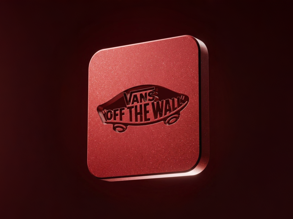
The 3-variable prompt system for turning any word or UI command into a precision optical-glass 3D button – without rebuilding the geometry, material, reflections, lighting & camera setup
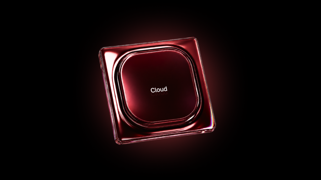
How to use the prompt
Variables: [BUTTON TEXT], [BUTTON COLOR], [BACKGROUND COLOR].
Replace [BUTTON TEXT] with the text you want (e.g. Submit), [BUTTON COLOR] with the button color (e.g. black), and [BACKGROUND COLOR] with the background color (e.g. white). Then paste the full prompt into GPT Image.This prompt works great for websites, social media, pitch decks, packaging, or any project that needs polished modern brand visuals.
This prompt works great for websites, social media, pitch decks, packaging, or any project that needs polished modern brand visuals.
[BUTTON TEXT = __________]
[BUTTON COLOR = __________]
[BACKGROUND COLOR = __________]

Create a single centered 3D interface button using a precision optical-glass and liquid-reflection product-CGI system.

## CORE OBJECTIVE

Create exactly ONE physical button, isolated in the exact center of the composition.

Translate a minimal digital UI command into a substantial manufactured object combining deep colored smoked glass, broad rounded optical geometry, mirror-like edge reflections and restrained spectral dispersion.

The visual identity must come from the geometry, Fresnel response, reflections and refractive edges — not from decorative rainbow gradients, neon lighting or excessive surface effects.

The button must always use the same fixed orientation and camera angle so multiple generations form one consistent visual family.

## FORM AND CONSTRUCTION

Construct the button as a low-profile rounded-square optical object consisting of three physically connected zones:

1. a square outer base;
2. a broad curved perimeter transition;
3. a large inset / slightly raised rounded-square central button surface.

The outer base must be almost square, with restrained rounded corners and substantial physical thickness approximately 5–7% of its total width.

Give the outermost edge a tiny precision micro-bevel rather than a razor-sharp edge.

The inner button should occupy approximately 80–84% of the outer body's width.

Use a significantly larger corner radius on the inner button than on the exterior base.

The inner geometry must not resemble a conventional computer keycap.

Instead, create an extremely broad continuous pillow-like fillet surrounding the central face: a smooth inflated transition from the nearly flat central surface into the surrounding perimeter.

The central face should remain broad and calm, with only an extremely subtle convex curvature.

The perimeter must feel molded or precision-cast as one continuous optical form, without decorative grooves, stacked outlines, extra rings or arbitrary trim.

Maintain believable manufactured thickness and smooth continuous curvature throughout.

## MATERIAL SYSTEM

Use [BUTTON COLOR] as the dominant body color.

The central face is deep smoked optical glass or glass-coated polymer tinted in [BUTTON COLOR].

Keep the material visually dense and dark enough to retain strong internal contrast while still reacting clearly to large studio reflections.

Central face:
— very low diffuse contribution;
— smooth semi-gloss to glossy finish;
— approximate perceptual roughness 0.08–0.16;
— deep tonal absorption;
— no visible grain;
— no scratches;
— no fingerprints;
— no metallic flakes.

Toward the broad rounded perimeter, increase the Fresnel response dramatically so the curved surfaces become almost mirror-polished and acquire a fluid black-chrome / polished-glass appearance at grazing angles.

The outer sidewalls and thin exterior bevel should feel slightly clearer and more refractive than the central face, revealing believable transparent material thickness.

Introduce subtle wavelength dispersion through these polished optical edges.

Spectral colors may include restrained cyan, electric blue, violet, magenta, warm amber, yellow-green and occasional red.

These colors must appear ONLY as physically motivated spectral separation around bright reflections, curved grazing-angle highlights and transparent edges.

Do not fill the button with a rainbow gradient.

At least 80–90% of the visible object must remain within the [BUTTON COLOR] material family.

## TEXT

Place the exact text:

"[BUTTON TEXT]"

once and only once.

Center it geometrically on the central button face.

Use a clean modern neutral neo-grotesk sans-serif typeface resembling restrained contemporary interface typography.

Regular to medium weight.

Small relative to the button.

Off-white to neutral white.

The typography must follow the perspective of the physical surface and appear printed beneath a thin transparent top layer or directly onto the internal glass surface.

Keep it crisp and fully readable.

No embossing.
No extrusion.
No outline.
No glow.
No oversized typography.
No additional symbols or UI elements.

A very faint physically plausible reflected ghost of the text immediately beneath it is acceptable, but keep it extremely restrained.

## LIGHTING

Use a controlled dark product-photography studio.

Primary source:
a very large rectangular neutral-white softbox positioned above-left and slightly in front of the button.

Its reflection should produce one broad smooth white highlight travelling continuously across the upper-left portions of the curved glass geometry.

Secondary source:
a long narrow neutral-white strip light positioned laterally and slightly below / beside the object.

Use it to create a narrow bright reflection tracing portions of the inner rounded-square perimeter and external bevel.

Add only a very weak frontal fill so the deep central face does not collapse into featureless black.

Surround the object with substantial negative fill so large areas of the polished material remain deep and mirror-dark between highlights.

No visible lamps.
No environmental scenery.
No bright ambient illumination.

## REFLECTION ARCHITECTURE

Treat reflections as structural elements that reveal the geometry.

Create long continuous white reflection bands that bend naturally around the broad rounded-square fillets.

The reflection must remain smooth and uninterrupted through corners.

Allow the white core of selected highlights to develop extremely thin spectral fringes at its boundaries due to optical dispersion.

On the transparent outer bevel, create narrow controlled cyan / violet / amber spectral edge reflections.

Highlights should become broader across large-radius curved surfaces and thinner across micro-beveled edges.

Preserve substantial black negative reflection zones between bright bands.

No random multicolor patches.
No neon outlines.
No glowing rainbow borders.
No holographic foil texture.
No oil-slick pattern applied across flat surfaces.

## FIXED CAMERA AND ORIENTATION

Use the SAME camera relationship for every generation.

Product-photography perspective resembling an 85–100mm macro lens on a full-frame camera.

Minimal wide-angle distortion.

View the button from a shallow three-quarter top angle, approximately 15–20° away from perfectly perpendicular to its front face.

Reveal a restrained amount of the near and side wall thickness.

Within the image plane, rotate the entire square button approximately 14° counter-clockwise so its upper edge rises toward the right side of the frame.

THIS ROTATION IS FIXED.

Do not randomly rotate the object between generations.

Do not place the button straight horizontally or vertically.

Do not use an extreme perspective.

## COMPOSITION

Exactly one button.

Place its geometric center precisely at the geometric center of the canvas.

The object must float independently against a seamless [BACKGROUND COLOR] void.

Keep clear negative space on all four sides.

The complete exterior silhouette must remain visible.

Do not crop the button.

Do not place secondary buttons, fragments, props, cables, hands, interface panels or other objects around it.

The button should occupy roughly 68–76% of the image width, creating a close product-shot feeling while preserving clean breathing room.

No floor plane.
No wall.
No horizon.
No pedestal.

## DEPTH OF FIELD

Keep essentially the entire central face and typography sharply focused.

Allow only an extremely restrained natural softness on the most distant exterior edge if required by the camera angle.

No strong macro blur.
No shallow-focus gimmick.
No bokeh.

## RENDER CHARACTER

High-end physically based path-traced product CGI with the optical precision of premium advertising visualization.

Accurate Fresnel reflections.
Physically plausible refraction.
Controlled chromatic dispersion.
Smooth broad fillets.
Clean anti-aliasing.
Subtle internal absorption.
Restrained contact occlusion only inside structural transitions.

The image should feel like a real precision-manufactured optical interface object photographed in a black studio rather than a generic glossy 3D icon.

## NEGATIVE CONSTRAINTS

Exactly one button only.

No multiple-button composition.
No keyboard.
No ordinary keycap proportions.
No flat UI graphic.
No app-icon treatment.
No thick conventional extrusion.
No sharp chamfered gaming-keyboard styling.
No excessive metallic chrome covering the entire object.
No rainbow gradient material.
No holographic texture.
No mother-of-pearl texture.
No neon glow.
No luminous edges.
No RGB light strips.
No excessive bloom.
No obvious lens flare.
No scratches or distressed surface.
No fingerprints.
No decorative rings.
No unnecessary seams.
No additional text.
No logos.
No random rotation.
No camera-angle variation.
No off-center composition.

Preserve the fixed centered composition, broad optical edge architecture, deep [BUTTON COLOR] body, controlled white strip reflections and restrained spectral edge dispersion in every generation.